
Data Vis 101 - Animate Over Time
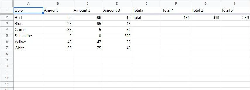
These Data Rigs that we’ve been making are useful, but the next level is animating data that changes over time. For this concept we will be building on the Pie Charts that we made last time, but this concept can be applied to all sorts of things. In this example I’ve also updated my linked Google Sheet to have more columns of data as well as more ‘totals’ columns.
This tutorial is written based on my specific Google sheet / CSV setup. Your spreadsheets will probably look different with different titles / columns / etc. You can refer to the below image if you get confused when I reference things like ‘Total 1’ or ‘Amount 3’ etc.
With the Google Sheet updated and Spreadsheet Utilities updated, we can ‘check’ the Interpolate Attribute on the Data Spreadsheet Utility. Currently in Cavalry v1.5, the Spreadsheet Lookup Utility doesn’t have the ability to interpolate, so we can go ahead and delete that (If you are using a future version and it does have an interpolate attribute, then you can just use that and skip ahead a bit).
Drag in another Spreadsheet Asset from the Asset Panel, name it something like ‘Totals’, set the Column Title Attribute to ‘Total 1’, check the Fixed Row Attribute and leave the value at 0 (Cavalry will ignore the first row in the column since it’s using that as the column name, and the rest of the rows are viewed as an Array which always start at 0. So row 2 of our spreadsheet in Cavalry is in position 0). Connect the Output of this new Totals Spreadsheet Utility into the Data Spreadsheet’s Remapping Source Maximum Attribute. Finally, make sure to check the Totals Spreadsheet Utility’s Interpolate Attribute.
Add a Value Layer, name it something like ‘Interpolator’, and connect it’s Output into the Column Title Attribute of both the Totals Spreadsheet Utility & Data Spreadsheet Utility. It might not be super obvious since it’s a Dropdown menu, but you can connect various things to it. It will accept values and change to whichever menu item corresponds to the value, with the top entry being value 0.
This Value Layer defaults to a value of 1, and this is correct for our Data Spreadsheet Utility (which wants to be looking at the ‘Amount’ column), however, it’s not correct for our Totals Spreadsheet Utility. We want to keep things simple though and only have one value controlling the animation, so to fix it we can just add an Expression to our Totals Spreadsheet Utility Column Title of +4 (Right click next to the Column Title > Add Expression).
Again, since Cavalry views lists as arrays, our spreadsheet columns of A, B, C etc will be viewed as 0, 1, 2, etc. So an ‘interpolator’ value of 1 puts our Data Spreadsheet Utility at column B of our spreadsheet, and we want our Totals Spreadsheet Utility to be looking at column F, so +4 in the expression.
Now everything should be looking correct in our Pie Chart.
We can scrub forward in the timeline to after our ‘pop in’ animation that we did last time ends, and then animate the Value Attribute of our Interpolator Value Layer from 1 - 2 over like 24 frames (or whatever you want). This will cause the Spreadsheet Utilities to step up proportionally from the data in the first column they are looking at, to the second column (B-C & F-G). Because we are interpolating both our data and our totals at the same time, the ring remains ‘full’ and each arc will continue to remain proportionally accurate to the whole, regardless of what the numbers end up being.
You can animate this Interpolator Value Layer whenever you want, and for as many columns of data you have. You just need to make sure that for each column of data you have, you also have a corresponding ‘total’ column using the =SUM(range) function.
At this point in my example, we see that the ‘Subscribe’ title and arrow are showing from the beginning, even though it’s value is 0. If you don’t want to see values that are 0, here’s what you do:
Create a Number Range Layer, name it something like ‘Visibility Range’, and make it a child of the Null in the Arcs folder. (It doesn’t strictly have to be a child, I just like to keep things tidy). Set the Source Min / Max Attributes to 0/1, and the Output Min / Max Attributes to 0/100. Connect the Data Spreadsheet Utility’s Output into the Value Attribute of this Number Range, and then connect this Number Range’s Output into the Null’s Opacity Attribute. What this is doing is saying ‘if my value is < 1, start dropping my opacity. If my value is > 1, keep my opacity at 100%’.
If you need to show the actual data numbers as text along with your Pie Chart, first disconnect the Names Spreadsheet Utility’s Output from the Titles Text Layer’s String Attribute. Click on the little ‘+’ icon next to the String Attribute’s text input box and add a String Generator. Set the Precision & Padding Attributes to whatever you need them to be (2 & 0 in my example). In order to get the true ‘un-remapped’ values, we need to duplicate our Data Spreadsheet Utility (ctrl/cmd + D), rename that to something like ‘Un-remapped Data’, and uncheck the Remap Data Attribute. When you duplicate a layer you also duplicate all of it’s children, so go ahead and delete the duplicated Interpolator Value Copy layer, and connect the output of the Interpolator Value Layer into this Un-Remapped Data Spreadsheet Utility’s Column Title Attribute. Finally, connect this into our String Generator’s Number Attribute.
For the actual name / title of the data, decide if you want the text to come before (prefix) or after (suffix) of the numbers. I’m setting mine up before the number, so on the Prefix Attribute, click on the little ‘+’ icon and add another String Generator. Set this one to Formatted String and connect the Names Spreadsheet Utility into it’s String Attribute. I don’t need to format my string so I’m going to set the Formatted String Attribute to just {0}. You can format your string however you need to.
At this point you will probably want to adjust the Titles Text Layer’s Textbox Width / Height Attributes to make the text look nice next to the Pie Chart. I’ve also added Apply Text Fill & Apply Typeface Behaviors to my Titles Text Layer to further format it. For the Apply Text Fill Behavior I’ve left everything default and set the color to white. For the Apply Typeface Behavior, I set my font settings to a bold weight, and then connect the Names Spreadsheet Utility’s Output to the Regex Attribute. This basically will apply the new font settings to only whatever word is in the Regex, and the duplicator automatically puts in the correct word per Arc group.
The last thing to do is to make this rig as ‘animation friendly’ as possible using an Animation Control Layer. When using an Animation Control layer on multiple layer’s keyframes, it’s important that each layers animation starts and ends on the same keyframes. You can do this by simply adding duplicate/redundant keyframes at the beginning and end of each layer matching whichever layer has the earliest or latest keyframe. If you don’t do this the timing will get all weird.
Add a Animation Control Layer to the scene and connect it to all of your animated layer’s Keyframe value indicator in the Layers Panel.
I don’t know if that’s what it’s actually called, but these things
DON’T connect the Animation Control Layer to the Interpolator Value keyframes. The Animation Control will let you ‘pop in’ and ‘pop out’ the Pie Chart Rig whenever you want, and you can animate the data using the Interpolator Value Layer independently.
And that’s it! You’ve now got a cool Pie Chart Rig that can show animated data over time, that you can show or hide easily whenever you want!
Support me - If you want to support the content I’m making, the easiest way to support is to subscribe and share my Youtube channel. If you are learning Cavalry you can buy some of my tutorial Cavalry files here, and I am also making my own plugins for Cavalry here.