
Data Vis 101 - Pie Charts
Next up in our Data Visualization in Cavalry series is the humble pie chart. We will be building on the same basic principals we looked at previously in this series.
We start by pulling in 2 copies of our Google Sheet and renaming them to something like Name and Data. We will also need to create a Spreadsheet Lookup Utility as well (more on that in a bit). In our Data Spreadsheet Utility, we need to remap our data like last time. However, unlike the bar charts where we set our Output Max Attribute to whatever height we want in our comp, since pie charts are circles we have to set the Output Min Attribute to 0, and the Output Max Attribute to 360. The Input Min Attribute will be 0, and the Input Max Attribute should be the total sum of all your data. In your Google Sheet make sure to create some columns to the right of your data and use the =SUM(range) function to get the total value of your data.
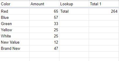
Make sure to add a column to the left of the SUM column to act as a ‘key’
In the Spreadsheet Lookup Utility, set the Lookup Column Attribute to ‘Lookup’, the Lookup Key to ‘Total’, and the Value Column to ‘Total 1’. This is all based on my Google Sheet and how I’ve named things. Take a look at the above image to see how things are being referenced. Having this Spreadsheet Lookup Utility means that even if the client changes data, our Cavalry rig will never break because everything is dynamic.
Connect the Output of this Spreadsheet Lookup Utility into the Value Attribute of the Data Spreadsheet.
Alt/Option Click on the Arc Shape tool, and style it however you want. Make sure to add a Color Array to it so that the represented data will be easy to tell apart. Make sure that the Starting Angle Attribute is set to 0.
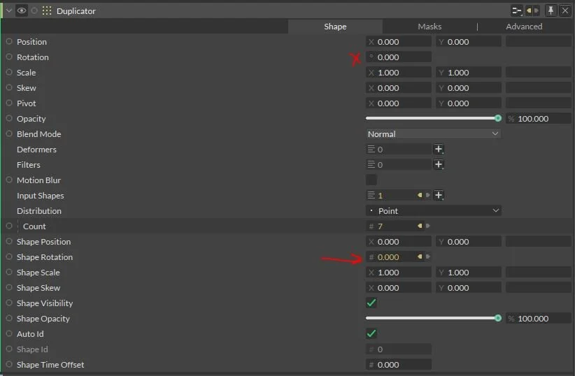
Connect the Output of the Data Spreadsheet Utility into the End Angle Attribute of the Arc Shape, and put your Arc Shape into a Group. With that Group selected, Alt/Option Click on the Duplicator icon in the Shelf, and set it’s Distribution Mode Attribute to Point.
Connect the Row Count Attribute from the Data Spreadsheet Utility into the Count Attribute of the Duplicator. It’s important to format your Google Sheet to have the ‘Totals’ information in columns to the side, and not the bottom. You want to make sure that your ‘row count’ is only counting data rows.
To make the Arc Shape duplicates line up properly, create an Accumulator Behavior, connect the End Angle Attribute of the Arc Shape into the Accumulator’s Value Attribute, and connect the Accumulator’s Output into the Duplicator’s Shape Rotation Attribute. (The duplicated shape’s rotation, not the duplicator’s rotation).
To add dynamic titles, it can be easier to turn off the visibility of our Duplicator and turn on the visibility of our Arc Shape Group while we format.
Create a Null and place it into the Arc Shape Group (it should be in the center of the comp). Connect the Arc Shape’s End Angle Attribute to the Null’s Rotation Attribute, and add an Expression of /2 to divide the value by 2. This will make the Null point to the center of the Arc Shape regardless of the value.
This arrow detail is optional
Create a Polygon Shape, set the Sides Attribute to 3, the Radius W/H to 35/35, connect the Color Array so it matches the Arc Shape, add an Align Deformer with the Y Value set to 1. Add a Bevel Deformer and set it to whatever you think looks good. Make this a Child of the Null and set it’s Rotation Attribute to 0 (When it’s added as a Child, it will adjust it’s rotation to be relative to the Parent’s rotation, but we want it to face the same way as the Null). Increase the Polygon Shape’s Y Position Attribute until it gets to the spot you want it to be.
Create a Text Layer, make it a Child of the Polygon Shape, and clear out it’s Rotation Attribute. Style this Text Layer however you want. Center the Horizontal and Vertical Alignment Attributes. Uncheck the Auto checkboxes on the Text Layer’s Text Box Size Attribute, check the Shrink to Fit Text Box checkbox (uncheck Allow Word Breaks checkbox if you want). Set the Font Size to something super huge, and then adjust the Text Box Size’s Width / Height Attribute’s to adjust how it looks (it’s a good idea to style this with the largest word in your data set). Connect the Name Spreadsheet Utility Output to the Text Layer’s String Attribute.
If you turn on the Duplicator’s Visibility, you’ll see that the title rotations are all over the place. This is where we add some math.
Create a JSMath Layer and add another Input Value so that there are two. You can rename these Attributes by Right Clicking and selecting Rename. Connect the Output of the Accumulator into N1, and the Null’s Rotation Attribute into N0. The equation you want to use in this JSMath layer is (360 - n0) - n1. Connect the Output of this JSMath layer into the Text Layer’s Rotation Attribute. This should now make it that the text is upright and legible no matter where on the pie chart it is located.
Next we need to make the Alignment dynamic so that it doesn’t crash into the graph.
Add an Align Deformer to the Text Layer, and also create two Number Range layers as well as a Math layer (a ‘regular’ math layer, not another JSMath layer). Rename the Number Ranges to ‘Y Align’ and ‘X Align’. Connect the Y Align Number Range Output into the Text Layer Align Deformer’s Y Attribute, and the X Align Number Range Output into the Text Layer Align Deformer’s X Attribute. For both Number Ranges set the Input Min/Max to 0/360, and the Output Min/Max to -1/1. Set the Math Layer’s Operation Attribute to Add. Connect the Accumulator’s Output to the First Attribute, and the Null’s Rotation Attribute to the Second Attribute. Connect the Math Layer’s Output into both Number Ranges Value Attribute.
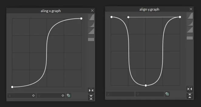
This makes things mostly line up correctly, but to make it perfect we need to adjust the Number Range’s Graphs. On the X Align Number Range’s Graph set it to be an ‘Intense S’ and the Y Align Number Range’s Graph set it to be a ‘Vase Shape’ with straight ‘walls’.
At this point, your titles should automatically adjust themselves to be aligned in a way that makes sense for where they are on the circle. You can play around with these graphs to get different results depending on what you are going for.
This Pie Chart rig should now be robust enough to handle changes from the client. If your client changes the value of any of the data entries, this rig will auto update so that the size of each arc is proportional to the total amount. If they add or remove rows, this rig will dynamically add and remove arcs.
Support me - If you want to support the content I’m making, the easiest way to support is to subscribe and share my Youtube channel. If you are learning Cavalry you can buy some of my tutorial Cavalry files here, and I am also making my own plugins for Cavalry here.